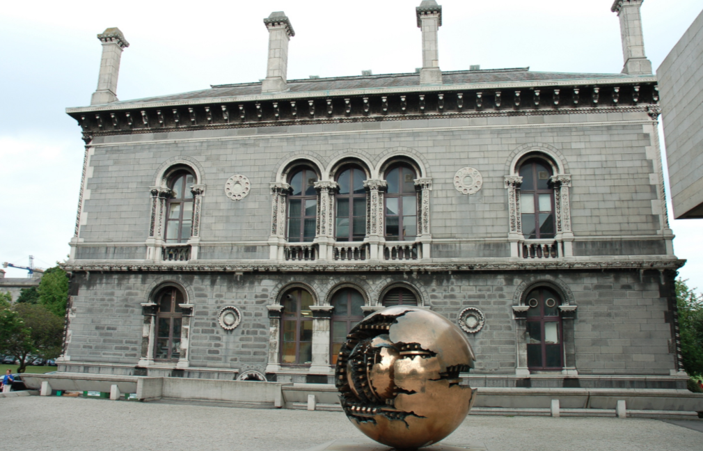
The Museum Building, located adjacent to the Berkeley Library, is often dubbed the prettiest building on campus, and it is easy to see why. With a bright exterior, the building is faced in Ballyknockan granite and punctuated with Portland stone detailing. Designed by architects Deane and Woodward, the building is Venetian in character and is said to be one of the greatest Irish examples of the Gothic revival. Deane and Woodward were heavily influenced by the work of John Ruskin, who stated that the Museum Building was the first true manifestation of his architectural principles.
The Museum Building was unusual at the time of its construction, with a considerably higher level of ornament than its neoclassical counterparts on campus. Ruskin held the view that builders should give their craftsmen creative freedom in their work. This was an idea that was seen often in Ireland but was somewhat unusual elsewhere. Notably, this can be seen in James Gandon’s Custom House, where he gave complete autonomy to his sculptor, Edward Smyth, whom he considered to be as good as Michelangelo. Taking after Ruskin, Deane and Woodward had little input in the design of the ornament of the building, with their only instruction being the dimension of the geometric forms. The creative decisions were left instead to the “red bearded” O’Shea brothers, who executed a series of meticulously detailed carvings depicting a series of different plants and animals. The result is one of the most beautiful and intricately detailed exteriors in Dublin. The concept of this work being artisanal carving as opposed to merely craftsmen following instructions is extremely important in this building.
Built to house the schools of engineering and geology as well as a museum, the building’s ornament reflects the types of teaching that were going on during the time. Of the 108 capitals carved by the O’Shea brothers, there are hardly two alike, and each one displays meticulous attention to detail. The incredible depth of the carvings, particularly those seen on the capitals, lends an element of plasticity to the decoration and provides a welcome contrast to the mostly ashlar surface of the facade.
The capitals of the pilasters feature some of the most impressive and varied carving in terms of subject matter and aesthetics. Plants, which were carved from life using examples picked from the College’s botanic gardens, depict a range of flora and fauna from shamrocks and holly to ivy and a nod to the classical tradition with the inclusion of a sort of pseudo-Corinthian capital using the acanthus leaf motif. It was only after a recently completed and very extensive cleaning effort that took almost three years and €500,000 to complete that the full beauty of these carvings was revealed. It was discovered that hidden under years of Dublin pollution were depictions of Aesop’s fables, among other references. Above the door, there is a depiction of the fable of the bird filling the jug with stones so that he will be able to drink the water. This is said to be a sort of visual pun – a metaphor for an engineering solution. Also depicted are squirrels, cats, mice and snakes, among others, dotted sporadically throughout the riot of plants. Seven panels in the eves have been identified as Aesop’s fables, with another adjacent to these which refers to Charles Darwin’s theory of evolution. However, not each individual design was a quote of a particular fable or direct reference to the building’s function, and some were more about contributing to the overall theme of the design.
The Museum Building displays a riot of intricate detail hidden in plain sight and rewards those who can take the time to admire it.


