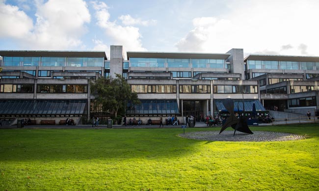
The Arts Building, completed in 1978, is by far the most contested building in Trinity and widely considered by many to be the ugliest. In the context of the elegant neoclassical structures that dominate much of the College, the Arts Building is often thought of as an appendage to the overall feel of the campus, generally seen as an afterthought or the product of a (perceived) lack of effort. The extent of this feeling towards the building resulted in it being glossed over throughout much of the architectural literature, with the first full study of the building coming only in 2012 by Dylan Haskins in his undergraduate dissertation. Despite these perceptions, the Arts Building reflects the modernisation of Irish society and a new era in the history of Trinity.
Until the middle of the 1960s, Trinity’s student population was small, with a total of only 4,000 students. The late 1960s and 1970s saw a major era of social change not only within Trinity but also in Ireland as a whole, which resulted in a huge increase in student numbers. Along with the general growth of the Irish economy, other changes including more women entering third-level education (the Provostship of Trinity was opened to women in 1967), the introduction of free second level education and the lifting of the Catholic episcopal ban in 1970 meant that student numbers were expected to reach up to 6,000. However, the college did not nearly have enough space to accommodate such numbers. A new arts building was proposed to solve the problem of the “massification” of higher education.
Built by the architects behind the Berkeley Library, Ahrends, Burton & Koralek (ABK), rumours run rife surrounding the design of the Arts Building, colloquially referred to as the “Arts Block” which more aptly, but perhaps unintentionally, captures its brutish, block-like nature. One particular tale favoured by students insinuates that it was supposedly meant to emulate the Hanging Gardens of Babylon but was built of a stone that was impermeable to natural life by mistake. There is some truth to this: gardens were originally planned for the projecting terraces but the plants were removed because of the unsuitable surface. Sadly however, the Hanging Gardens of Babylon are nothing more than a tall tale.
The gargantuan complex probably would have been better suited as a series of buildings as proposed by principal architect, Koralek, but was not favoured by College officials
The College established a committee to oversee the development of the new building which was headed by Myles Wright, who made the decision to locate the Arts Building along Nassau St completing the geometry of Fellow’s Square. The committee gave the architects a brief which gave little direction on style: “No restriction on architectural form or style and free rein is given to develop the site in any way which fulfils the requirements … but … the board will attach great importance to the relationship between the proposed new building and those now existing.” It may appear that this incredibly vague brief would have been the cause for the appearance of the building.
However, it was the choice of site which had the most consequential impact on the facade. The proposed site would see the finished building taking up 175,000 square feet and the new complex was required to combine the functions of several buildings into one. The design is therefore the product of an attempt to deal with issues of space and light and the depth of the site meant that natural light sources would be a major issue. The unusual stepped granite facade was one of the means of dealing with this problem. It also meant that the building would not dwarf the opposing Old Library. Even with this stepped profile, the building is still massive, and the gargantuan complex probably would have been better suited as a series of buildings as proposed by principal architect, Koralek, but was not favoured by College officials.
The seemingly random but actually very clever interior layout is ABK’s solution to problems of light. Classrooms and offices were prioritised while corridors, stairwells, toilets and other utilities that need no natural light were placed centrally. Many rooms, however, did not make the cut, and were left windowless, resulting in the many familiar lightless, lifeless seminar rooms. The issue of light, however, does not explain the rather gloomy interior with its unsightly use of dark brown stones on the floor and poured concrete ceilings. Instead of being arranged in a linear manner, departmental rooms are organised in clusters, making the space inside slightly less impersonal than its uninviting exterior may suggest. The spaces relate to each other while maintaining their own unique identities.
The building was designed to accommodate 3,700 people and today there are 4,500 students in the faculty of Arts, Humanities and Social Sciences
The Arts Block is a building that was created with function in mind, something that we have lost sight of today. This is largely due to overcrowding, as the the building was designed to accommodate 3,700 people and today there are 4,500 students in the faculty of Arts, Humanities and Social Sciences. Despite its formidable exterior, the architects designed this with functionality in mind, evident from the strong lines of communication that were maintained between the architects and the developmental committee.
ABK never intended for this to be any sort of grand architectural statement. On the contrary, they devoted a huge amount of time to ensuring that the building would fulfill its function and accommodate the needs of its occupants both at the time of its opening and going into the future. What the design of the Arts Building lacked in aesthetic value and structural finesse it made up for in a functional hierarchy of space.
It is often wondered by many why the Arts Block was not designed to replicate the grandeur of its neoclassical predecessors, but to do so would be pastiche, an imitation of the past instead of a step towards the future. Progress and innovation are values that Trinity prides itself on and to copy the style of the older buildings would have been a violation of the college’s ethos, and would have been criticised as such. Trinity has always and will always be pioneering in everything it does, and the Arts Block is no exception to this.


