The Hamilton Building on the East end of Trinity’s campus is not known for its architectural allure, and is generally overlooked in favour of its more popular counterparts on the west side. Built between 1988 and 2000 by architects Scott Tallon Walker, the Hamilton was one of the first major developments on the east end of campus. Despite the building’s blatant lack of charm, the design manages to overcome a number of difficult planning issues, even if its manner of doing so is less than elegant.
The building is attached to a line of Georgian townhouses on Westland Row, which reveal very little, if anything at all, of the structure that extends behind them. Aside from the obvious problem of building on listed properties, the building needed to be large in order to accommodate for a number of student and staff facilities, and as a result, the building is absolutely enormous. Due to its large size, the construction of the Hamilton faced the same problems as the Arts Block in terms of administering light. However, in this case, the design was somewhat more effective than that of the infamously dark interior of the Arts Block.
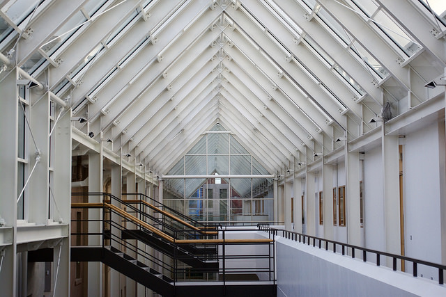
A long glass tunnel or “winter garden” runs down the centre of the building, allowing natural light to enter, serving as the building’s primary thoroughfare
A long glass tunnel or “winter garden” runs down the centre of the building, allowing natural light to enter, serving as the building’s primary thoroughfare and, importantly, making the link between old and new – as well as serving as a home for the odd pidgeon. The interior junction of the new Hamilton Building, with the old Georgian houses visible, is a bit odd. The original line of the houses remains, but with a network of beams and rods attached and white staircases leading to them.
The west facade of the building is quite unattractive, composed of granite blocks punctured by square windows. An open-air walkway runs along the ground floor, allowing a view into the mysterious laboratories. There is nothing particularly notable about this elevation, except for the occasional peeks of the glass tunnel that provide a respite from the monotonous granite block.
The inside of the Hamilton is cold, grey and uninviting, much like its exterior. The entire structure is not in any way sensitive to its Georgian neighbours. While the building fulfils its function relatively well, the design completely forgoes aesthetics, and has left us with a rather unpleasant building to look at.


