After a six-year-long renovation, the National Gallery of Ireland will finally reopen its old wings tomorrow following an extensive refurbishment carried out by Heneghan Peng Architects. The project saw the removal of the majority of the main systems from the building, placing them in a new energy centre underneath the front lawn. Despite the extensive works that took place, the architects have successfully retained the building’s historic charm while also modernising it and making it more visitor-friendly in line with contemporary museum design practices.
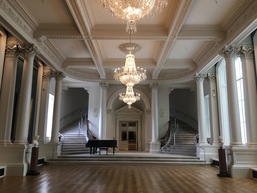
The restoration work throughout the gallery is magnificent and the architects appear to be acutely aware of the building’s architectural precedence. The ground floor saw some of the largest and most impressive changes. A series of old forgotten windows were reopened after having been covered to create more space to hang paintings. The windows themselves are beautiful in their own right, and with this amendment, the Shaw Room is almost unrecognisable, now flooded with light that brings attention to the room’s subtle stucco work and adding even more drama to the grand sweeping staircases.
Additionally, a new small room has been added to the ground floor layout. It is a dark space, designed specifically for the display of Irish stained glass and features the work of Irish artist Harry Clarke, including a small cabinet designed for a private patron that has never before been exhibited to the public.
Perhaps the most striking improvement on the ground floor is the addition of a bright double height courtyard in between the Milltown and Dargan wings, which was part of the original construction of the building but was concealed by the blocked-off windows. Contrasting with its richly decorated neighbours, the space is sleek and minimal with a glass roof connecting the exposed outer brick walls of the two original wings. A single sculpture occupies the space – a large seven-metre tall piece designed specifically for the courtyard by Cork-based artist Joseph Walsh. The smoothly curving wooden sculpture softens the otherwise austere space. Upstairs, the rooms appear largely the same as they used to but look fresh with newly painted walls and relaid floors.
The renovation is sensitive to the gallery’s history, and while the restoration work was done to keep to the original style of the building, any new additions have been executed in modern materials so as not to appear as pastiche elements. The new additions, however, all remain quite minimal and detract little attention from the buildings with the exception of the ventilation grilles, which mimic the existing Victorian ironwork. Sadly, the original oak doors at the main entrance to the gallery no longer exist. Instead, they have been replaced with a new glass doorway and seamlessly blend the old facade with the new entrance hallway.
The National Gallery of Ireland’s reopening marks a fresh start, and one of the main aims of the renovation, aside from restoring the building, was to make the gallery a more visitor-friendly experience. Every aspect of the gallery has been extensively considered. Not only was the entire building restored, but the gallery has a completely new hang and layout of artworks, which were designed by the gallery’s curators. Surprisingly, considering the modern approach to museum design taken by the architects, the curators have taken a more traditional route in terms of the new display of paintings. Many of the displays see a double hang, which is unusual today as many galleries today adopt a single row format for displaying paintings. However, this layering of paintings does not appear overwhelming and has been very thoughtfully carried out, with the paintings appropriately grouped and balanced throughout the walls.
While all of the rooms are hung chronologically, the artworks now have a greater dialogue with each other as a result of a new layout of loosely thematic groupings within the same room. Upstairs, the former Baroque Gallery, which featured Italian works, has now been re-imagined as the Grand Gallery. Its aim is to capture the Age of Enlightenment, and the hang reflects that of an 18th-century Irish country house, accounting for the time in which these works were created. The curator’s attention to detail is apparent in the display of Joshua Reynolds’s portrait of the Earl of Bellamont, which is flanked on either side by elaborately framed mirrors, a subtle nod to the Earl’s reputation for vanity.
Complementing this new display, each artwork now features an information panel. This is a significant improvement considering that previously information on some of the artworks seemed to be like a well-kept secret. In addition to this, the gallery has completely updated their website to make it more user-friendly and now has a complete directory of every piece in the collection.
After multiple delays and complications, the completed €30 million renovation certainly does not disappoint. With both the artworks and the building itself being restored, the gallery feels fresh yet familiar, now state of the art and somewhere that will always be a joy to visit.


