Joe Scullion’s As It Goes, an exhibition currently showing at the Kevin Kavanagh Gallery, has been a source of great anticipation for the last month or so. This is primarily because of the baffling way in which the show is described on the gallery’s website. In the exhibition, the gallery outlines, “interiors and exteriors merge, voids and forms are interchangeable and within the pictorial plane, perceptual slippages occur. Spatial boundaries assert and digress continually, creating an assemblage of fragmentary gestures that affirm a cohesive whole”. Perhaps this description is helpful to some very sophisticated subset of society, but, as a layman, I was entirely stumped. The description had mystified me, and I was particularly eager to see for myself what Scullion’s work was all about.
Arriving at the exhibition, I was struck by the size of the paintings. Most of Scullion’s pieces are roughly the same size as a sheet of A4 paper. In order to really see the detail in Scullion’s work, the viewer is compelled to get as physically close to the paintings as possible. A piece entitled “Close Enough” is particularly impactful, despite its size. Standing inches from the painting, I am entirely drawn into a scene depicting what appears to be a darkened room with a lone window: the artist effectively creates the glow of a warm, pink light streaming through the window in this otherwise angular, rigid scene. The effect is one of complete immersion.
“Stand” is perhaps the most memorable piece in the exhibition. Scullion creates an image of a perfectly smooth pink arch in scratched, grey surroundings. The piece draws the eye with a flash of cool-toned pink, and demands further attention as it bends traditional notions of structure and shadow. The arch is imposing, three dimensional, and unapologetic in its stance. In removing this object from its natural surroundings, and placing it in a decidedly flat, unreal arena, Scullion succeeds in making the viewer re-examine their perception of a commonplace structure. As silly as it sounds, looking at this piece, I feel as though I’m seeing an arch for the first time in my life.
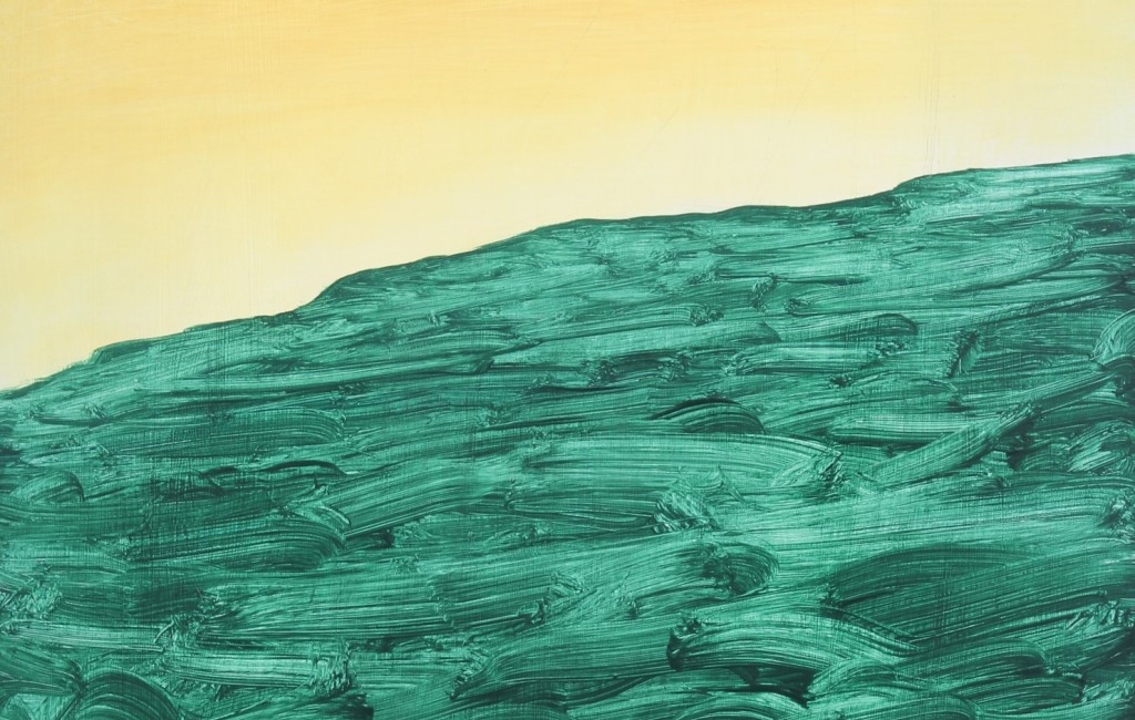
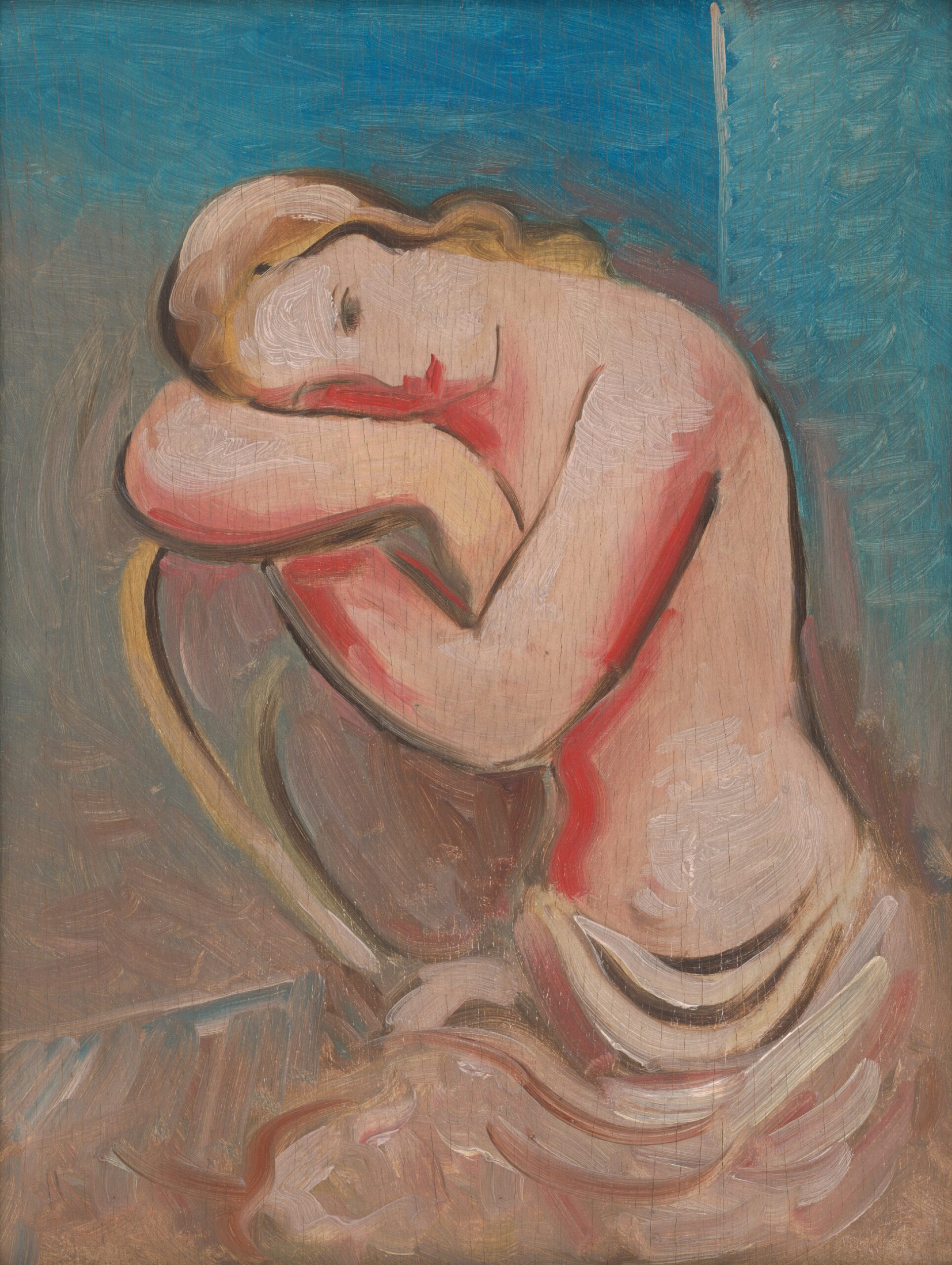
With the exceptions of “Close Enough” and “Stand”, the exhibition is entirely comprised of paintings with a neutral, muted colour palette. Almost everything is brown, beige, white or grey. This, in combination with the small size of the pieces, results in a first impression that could be considered lacking. Moreover, many of the pieces depict only vague shapes. “Pointing”, for example, portrays a tiny black dot on a small white and yellow canvas, and “Older” conveys an off-white X on a black background. As It Goes won’t be everyone’s cup of tea. However, “Close Enough” and “Stand” are outstanding, and Scullion’s use of structure as a tool of defamiliarization is excellent.
If you’re looking for a flurry of colour and activity, this exhibition isn’t for you. If, however, you’re in the mood to bend your mind around some impossible structures, head down to the Kevin Kavanagh Gallery before October 27th.


