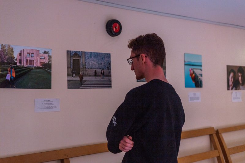
Dublin University Photography Association (DUPA) has enjoyed a huge increase in popularity over the last two years. At this point in time, the society’s presence on campus is unmissable. Multicoloured DUPA stickers can be seen on laptops around the Ussher, the society’s exhibitions are often the centrepiece of Arts Block conversation for days before and after the event itself takes place, and of course, the much-coveted black DUPA beanie is now instantly recognisable to any Trinity student.
The society’s presence on campus is undeniable, but its presence online is perhaps even more striking. It seems that what DUPA has, in addition to an array of extremely popular events and classes, is a fully formed brand. Speaking to The University Times, the society’s public relations officer (PRO), Vicky Salganik, stresses that accessibility is the key concept behind DUPA’s branding. “I always think about what scared me when I started”, she explains. “Basically, every time I write any Facebook post or anything like that, I think about when I was too scared to go to anything. So now I’m like: ‘No camera, no problem.’”
Emma Kinney, the secretary of the society, is quick to state the importance of social media in cultivating DUPA’s accessible atmosphere and subsequently the society’s rise in popularity. She cites Instagram as a vital tool, stating that it’s “definitely one of the most important aspects of the rebrand”. DUPA’s Instagram is one of the most popular of any society on campus. Kinney says: “We had maybe 300 followers on our Instagram last year, we just hit a thousand this week. That was due to the committee last year and this year.”
As a society focused on photography, DUPA is a perfect candidate for an aesthetically-pleasing Instagram profile, but Salganik’s approach to the social media platform is more dynamic than one might assume. Rather than exclusively posting pretty pictures, Salganik intersperses the feed with personalised memes, each one designed to introduce and roast a member of the society’s committee. Many of Trinity’s large societies are considered intimidating, and by publicly making fun of the committee, Salginak ensures that DUPA maintains its down-to-earth reputation. “The whole ‘Meet the Committee’ thing is just roasting every committee member”, Salganik says.
Hiba Awan, the society’s visual communications officer, is determined to convey DUPA’s accessibility through graphics. Always stamped with the society’s trademark shutter-shaped logo, DUPA’s exhibition posters are decidedly distinctive and always eye-catching. Awan states: “I think for us, because we’re a photography society, which is a space for creative people, the best thing to do in terms of graphics is to keep it simple.”
