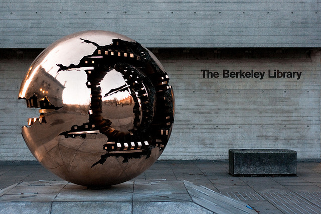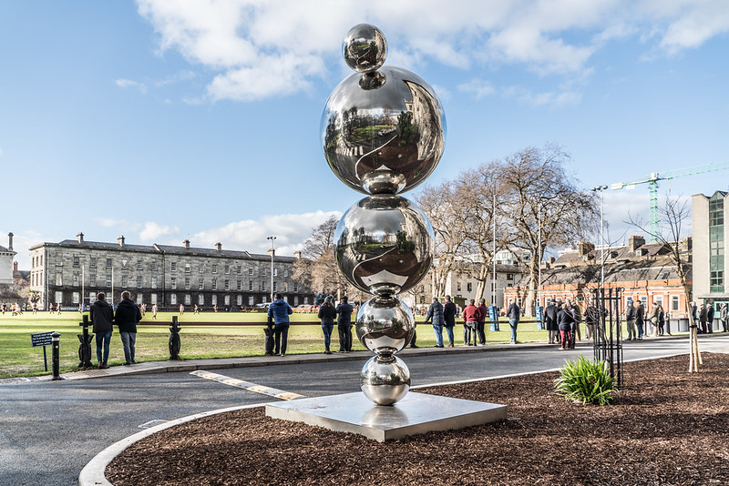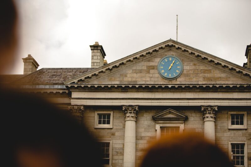
A crisp January morning and under a bright blue sky charred with the trail of a jet rests the Berkeley library. It sits sleepy like a docked vessel in a blocky shipyard, its granite glistening like glitter on the face of a Trinity baller, its large curved glass windows giving rippling reflections of its surroundings. I walk towards it, past the flock of American tourists and country school kids outside the Old Library. As I pass, the booming voice of an American woman rises above the hum of the crowd, she squints at the adjacent Berkeley and exclaims in a brash tone, “now that’s a piece of shit”. Indeed, the Berkeley may not be the most admired building on campus. However, when one looks beyond its bulky mass, it is undeniably beautiful.
Constructed between 1961 and 1967, the Berkeley will celebrate its 50th birthday this year. It was built with a view to accommodate the ever-increasing Trinity student body and designed by Paul Koralek of Ahrends, Burton and Koralek. The Berkeley exemplifies the aptly named Brutalist style of architecture, a distinctive and often unadmired style of the 20th century. Yet admiration is what this building deserves. Positioned behind the line of the Old Library and the Museum Building, Koralek skilfully ignites a conversation between old and new through his use of building materials.
Sheathed in Wicklow granite, the Berkeley concurs with the established structures on campus. Indeed, its scale and proportions are reminiscent of the neighbouring Museum Building. However, it is not like the others. The Berkeley is a lone wolf venturing into uncharted architectural territory, undoubtedly challenging Trinity’s traditional ways. Bright, local concrete was poured into giant wooden casts, lending a sumptuous textural finish to the building. Bespoke cockpit-like windows glorify the first floor and frame the less famed beauty spots of campus. The use of concrete is maintained within the library in the form of angular desks, pillars and chalky polished flooring. An undulating lead roof crowns the structure like an icy blue mountain range rising towards the heavens.
Equally bespoke is the interior, with most of the furniture designed by the architects and purpose made for the building. Rows and rows of birch plywood shelving divide the expansive first and second floors, holding 829,000 books and creating a maze of compact study spaces. The Morrison reading room on the first floor pivots on a light filled sunken court. Study desks fill the hollow alluding to a NASA control room rather than an academic hub. The imaginative soul of the building percolates down to the basement, where a narrow flight of concrete steps lead down to a long dark underground passageway, linking the Berkeley to the Old Library. The tunnel terminates in a concrete spiral stair which feels more like a part of the Gryffindor common room than a piece of 20th-century ingenuity. It is this theatricality and imagination which makes the Berkeley what Wordsworth would call “a violet by a mossy stone” on the Trinity campus. Love it or loathe it, it is anything other than “a piece of shit”.


