Some artists are known for being sacred about their talents and taking pains to point out to you – the untalented, that is – that you just don’t have the same capacity to see the world in as deeply profound a light.
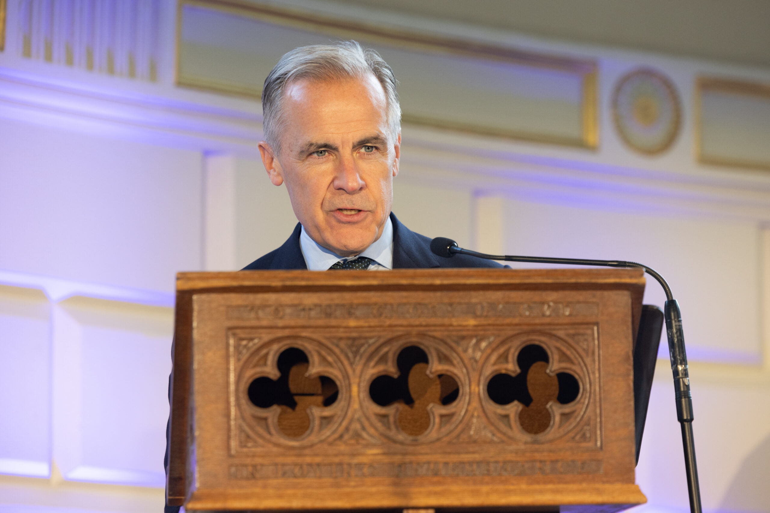
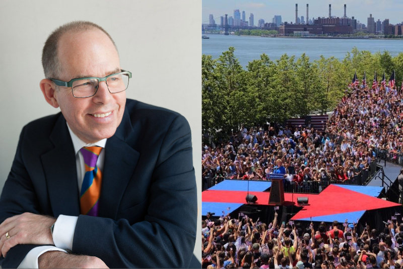
Michael Bierut, the acclaimed graphic designer and creator of the once ubiquitous “H” logo of Hillary Clinton’s 2016 presidential campaign, is not one of those artists. “It’s funny. It’s kind of bullshit on the one hand”, he declares, talking about the agency of colour and imagery to convey a message. He’s frighteningly frank on the matter. His livelihood, after all, is dependent upon this so-called “bullshit”.
He panders to the more reflective side of the argument: “But they’re also tiny little stories, tiny little bits of narrative that help you frame up things that otherwise have no meaning.” And in this sentence, with impressive brevity, Bierut gets to the crux of what we’ve been talking about for nearly an hour.
The idea that a political campaign’s choice of a green or purple colour scheme could be the deciding factor in a voters’ decision is, indeed,“bullshit” – do we really have such a lack of control over our decision-making faculties that we might decide on the future of a political system based on the difference between two shades of the rainbow?
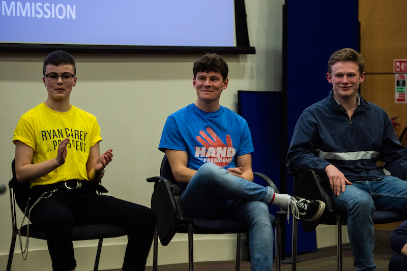
Are we not above such trivial features of a campaign? Consider this year’s tight race to become Trinity College Dublin Students’ Union (TCDSU) communications and marketing officer, for instance – will the result really be determined by the by the ideas of energy and passion supposedly evoked by Hiram Harrington’s red campaign, or will Philly Holmes’s green colour scheme win students over by subconsciously bringing ideas of renewal and prosperity to mind?
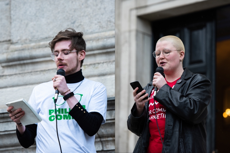
It remains to be seen whether voters will be swayed by the design choices of communications candidates
I want to say no. But, according to Bierut, it’s not so simple.
The methods by which these colours are harnessed, Bierut explains, might genuinely serve to narrativise a candidate’s message, and thereby add to its appeal and perceived legitimacy. The job facing Bierut and his designer counterparts then, is to identify and cohere these “little stories” – of colour, shapes, typeface – to articulate the very essence of a candidate and their vision.
It dawns on me that the work that Bierut is perhaps most famous for – Hillary’s “H” logo in 2016 – ironically, was successful mostly due to the fact that it was completely untethered to any one colour scheme. People could present the right-pointing arrow across the two block parallel lines in any number of ways – it could be made of food on the dinner plate, sea shells on the beach, pages of a textbook. It was everyone’s to own and everyone’s to make. It was never associated with blues, yellows or reds.
Given that Clinton did ultimately (although inconsequentially) achieve two million more votes than her opponent, could it not be said that colour schemes don’t actually matter?
Hillary Clinton had 100 per cent name recognition, right? So there is virtually no one in the voting public who hadn’t heard of her
Reflecting on this, Bierut explains the thought process that went into creating such a pliable image as the symbol for Clinton’s campaign: “Our candidate had 100% name recognition, right? So there is virtually no one in the voting public who hadn’t heard of her, and, moreover, most people had already made up their minds on what they thought of her.” The challenge Bierut and his team at Pentagram design studio had to overcome, then, was not the same one that faced Barack Obama’s campaign team in 2006 – they were tasked with placing a virtually unknown figure on the map of American politics. Similarly, the team of any “outsider” candidate in this year’s TCDSU elections is required to establish their identity and reputation and to legitimate their intentions and reasoning behind running for the position.
The advantage of this, however, is that “outsider” candidates don’t have perceptions or myths to debunk. Neither Harry Williams nor Eoin Hand, who are up against one another in the race to become TCDSU president, for example, have any experience with TCDSU and, therefore, do not have a “hack” image to deconstruct. Their opponent Ryan Carey, the union’s current gender equality officer, however, has been forced into a position in which he has had to fight against the idea that he is the “institutional”, or conventional, candidate. This was the challenge facing Clinton in 2016.
Neither Eoin Hand nor Harry Williams had to deconstruct preconceived ideas of themselves, while Ryan Carey has fought the idea that he’s an insitutional candidate
Indeed, Bierut’s design had to weather the preconceived notions of large swathes of the voting public and, somehow, shed the weight of a reputation that had been accumulated over some 30 years in politics. “One of the things we wanted to do was destabilise those decisions”, he explains. “We wanted to make her presentation have the capacity to surprise people, to be changeable, to be participatory.” The design may not have been attached to any one colour scheme, but this non-use of colour served to convey the principle message of Clinton’s campaign – that she would make for a dynamic and inclusive president.
Working within these parameters of public opinion – or indeed, the parameters of any design brief, or intended demographic or intended message – Beirut says, is what distinguishes the designer from the artist. “Art is like fiction, while design is like non-fiction. We [designers] are starting from a set of facts and trying to figure out a way to make them coherent”, he explains. Bierut says that a campaign’s creative director is tasked with producing an image that shapes, arrays and communicates already-known facts in a more engaging or digestible way. This is what excites Bierut about his job – he isn’t required to create a fantastical world, but to operate within the one we live in and create designs that will “escort ideas” through it.
“Designers are planners”, Bierut says. The images, colours, slogans and themes that a campaign wraps itself around are each selected with a view to fulfilling a carefully conceived strategy to grasp the voting public’s attention and, ultimately, their vote. Consider the race for editor of The University Times, for instance. Both Susie Crawford and Cormac Watson have produced undoubtedly appealing campaign visuals in their opposing bids for the position. Crawford’s candy pink is fun and eye catching, while Watson’s turquoise green is slick and professional, reflective of both candidates’ central campaign messages.
In the race for editor of The University Times, Susie Crawford and Cormac Watson’s design choices have mirrored the themes of their campaign
“But you can’t plan your way to victory”, Bierut warns, lamenting Clinton’s loss in 2016. “There has to be some sort of passion, but also the agility to marshall this passion through it all.” Bierut is all too aware of the fact that images and design alone cannot dictate the outcome of an election: following Clinton’s disappointment in 2016, he remains unconvinced of the independent and determinant power of campaign visuals.
“At the end of the day, logos and typefaces and colours don’t do the communication for you – they frame that communication, they put your team in uniform so that they understand who to pass to and who to tackle”, he says, resorting to a football analogy that takes me by surprise. “The colours and the uniforms don’t control where the ball goes, right?”, he explains. “It’s the ingenuity of people that does that.”
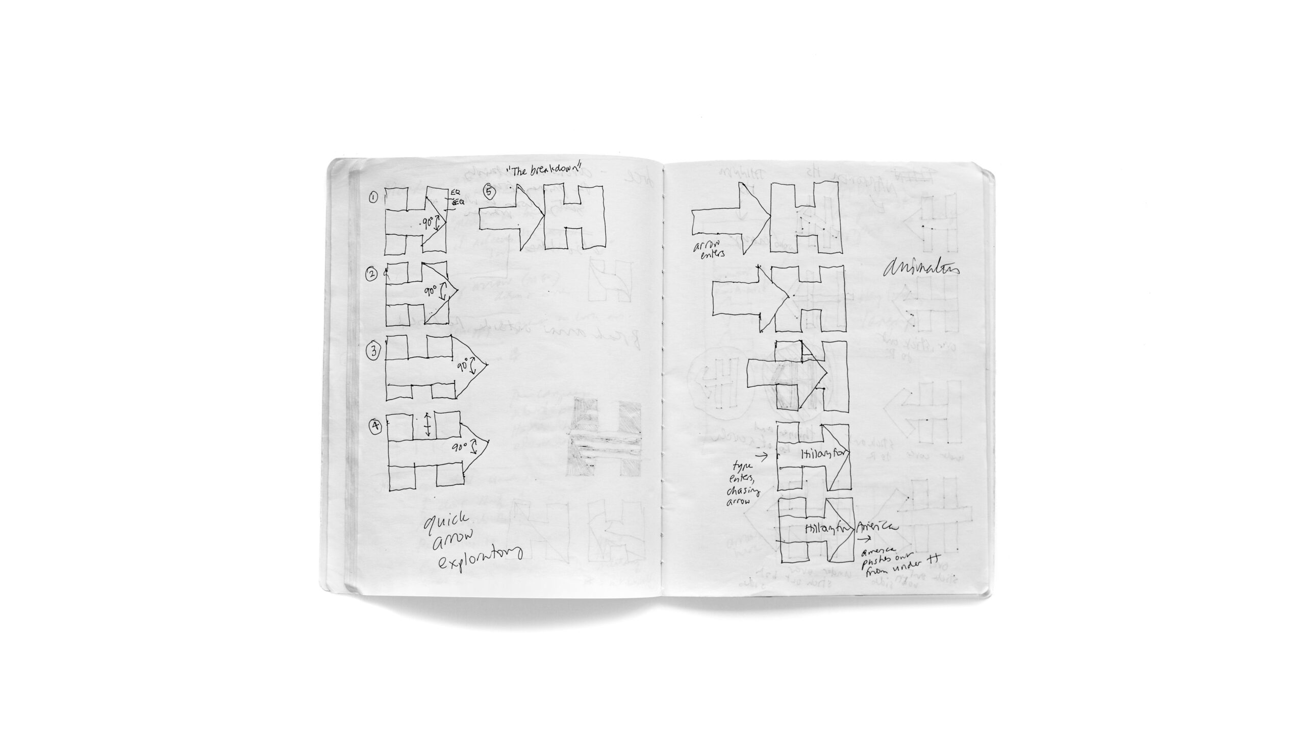
Early sketches of Michael Bierut’s design of Hillary Clinton’s famous “H” logo
And so we’ve come full circle. The imagery of a political campaign is meant to concentrate the essence of a candidate’s message into visual form. But in a world in which the agency of social media and inescapable capitalism is relentlessly explored if not repeatedly bemoaned, there is a tendency to overestimate and indulge the notion that humans are wholly at the behest of optic appeal and satisfaction.
When people come across a block capital H with an arrow running through the middle, many of them will be reminded of Hillary. But, according to Bierut, it was her ability to expand upon her vision, articulate its intricacies and harness these visuals to further her appeal that ultimately won her the popular vote.
In reality, Bierut’s symbolic “H” is an arbitrary organisation of shapes that don’t actually have anything to do with the tenets that govern the principles of the Democratic Party. Unsurprisingly, Bierut encourages candidates to make use of the evocative power of design, colour and imagery. In saying this, however, he eagerly underlines the fact that this alone won’t win them the race – after all, “it is kind of bullshit”.